
Foreword
As of today all my apps combined have reached 14 million – mostly free – downloads. I started playing with iOS dev in 2008 and have a total of 10 apps currently still in the market three years later : each both as a paid and free version. So I have 20 entries published on the AppStore. I even had a few more but I trashed them because they either failed or sucked. Actually it was usually both, and that's no coincidence.
I am not going to brag too loud about how smart I had to be to achieve several milion downloads with my bare hands because most of this relative success was obtained through trial and error... and probably a sheer amount of shameless luck. In the end, while I couldn't say so when I started developing for my iPhone I think I now understand the basic steps that lead to a download or sale.
To sum this up: I am not a marketing expert talking about something I understand in theory and I wish I actually did in practice. I am a developer who did something that actually worked and now tries to understand why the hell it did.
Why should they pick MY app ?
The average iOS user has a very short attention span and there are 200 apps that do exactly the same stuff yours does. You have to win at each step, and the decision will be made in less than 60 seconds (and that's for the slow ones!). Whether you manage to get your app in some Top 50 ranking or your app shows up through search, the same steps apply. That's the way I look at it and I believe many people do. Bringing the user to a download amounts to convincing him to go through a series of gates, always chosing yours.
- Gate 1: The user likes and understands the icon
- Gate 2: The user understands the name
- Gate 3: The description is short and enticing
- Gate 4: The screenshots are understandable and beautiful
-
Gate 5: The reviews are good
-
You won, the user finally entered the Dungeon of download. In the dark, you notice a treasure chest.
If the user picks any other gate at any of the steps above the download / sale is likely to be lost. The user will not even try your app. So in a sense, sadly the above is more important than your app itself.
Yeah, that's pretty much it. Correctly preparing the gates above took me from my day job in Switzerland to being an indie developer anywhere I want to be. But let's not talk about Brazilian coconuts right now and look at each one of these gates.
First gate: The icon
![]()
![]()
![]() This one is pretty simple. Pick a screenshot of the AppStore on your iPhone with a search corresponding to your app and look at the icons in the list. Ask friends to pick the one they'd want to try. If it's not yours, then go back to work. Consciously or not, people tend to chose the icon based on two basic criteria:
This one is pretty simple. Pick a screenshot of the AppStore on your iPhone with a search corresponding to your app and look at the icons in the list. Ask friends to pick the one they'd want to try. If it's not yours, then go back to work. Consciously or not, people tend to chose the icon based on two basic criteria:
- The icon looks like the app will do what they are looking for
- The icon looks prettier than the others
It might sound obvious but if you are selling a book reader then an icon representing a beautifully designed book, will work better than the image of a Penguin. That is true even if the penguin is cute. This might be different if you're a big brand and your symbol is already recognizeable but then I guess you wouldn't be reading this.
Second gate: The name
Whether or not you think it sounds stupid GoodReader sells better than Geoffrey. Users will not spend the time to look up your obscure reference which makes you feel smart in front of your friends once explained. Mind you, my overly successful Battery app is called Battery HD. Nothing fancy, yet it works. What do you think the results would be if the app was named "Energy wave" ? I don't want to try so this is left as an exercise to the reader.
If it's not descriptive then the app name could also be intriguing. For some reason my We are SO Dead app recently stroke some cord in Korea and made a quick jump to overall #2. My belief is that this was due to the new release being restored to its original name. Previously the app was named "Time to Live" because I had to temporarily change the name when the app was first published in 2009 and Apple didn't have age categories. This app had been almost forgotten for two years, but then I released a free version, translated it to various languages (including Korean) and restored the original name. Note that this app isn't my core business but now at least it's worth updating.
Third gate: The description
Again simplicity rules. If you're still in the selection at this stage, chances are users have chosen 10 other icons besides yours. So they have ten descriptions to "read". If they don't get it at a glance they just won't read. If your description is too long they' won't even scroll down to your screenshots, which is only a good thing is your screenshots are truly awful.
Being the cynic that I am, I have always been reluctant to cheap positivism in advertising. Sadly I have seen that changes in a description where you mention your app is the best, does work.
Do not underestimate the value of good professional translation. This should be true for the app itself but starting with the description is a good step already. All markets might not be worth the cost, but if you're not translating into French, Chinese and Japanese at least then you're wasting a lot of good opportunities. As a matter of fact most of my apps are translated in all the main languages. Even if the average German for example usually understands english better than the average Japanese both will appreciate you taking the time and effort to localize for their huge market.
Unless you update your description often (which should not happen if you keep it to a minimum), translation is a one-time cost that will bring recurrent revenue increase.
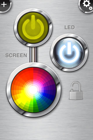
I wrote a LED Flashlight app when there were already dozens around. Well, believe it or not it's making a decent amount of money (mostly from advertising). All that with a description that is only seven lines long.
Fourth gate: The screenshots
 There's no magic here: clean-looking and beautiful sells. So yes, if you can't design, hire a designer. It'll pay for its cost in the long run. People won't care much that your app is the most efficient for one task if they don't feel any attraction towards your pretty images: they will just never know since they won't download it in the first place.
Also don't over-do it. Adding screenshots of all secondary settings screens is worthless unless they show an option that is really a selling-point in itself. Think about it the Apple® way: if it's not impressive, don't show it.
Fifth gate: The reviews
Well, you don't have any control over this, do you ? You can't hold a gun to your users' head to tell them what to write. Yes, I wanted to do it too but it turns out to be illegal. Bummer. Plus I believe Lodsys has a patent on this.
You can still:
- Ask for feedback and let users easily contact you, rather than write a bad review
- Ask for positive reviews but don't force them upon people (no bloody popups ! )
- Be so awesome that they'll have no other choice. I didn't say it was easy.
My next post will discuss my approach on how to handle feedback and reviews. Stay tuned.
